3 min read
App Stories Legacy CMS
The guide for the new, App Manager Stories tool can be found here.
App stories are an interactive content carousel that can be added to the top of the home screen in your Poq app.
Each story is made up of a sequence of images that are shown in a fixed order, for a fixed amount of time.
Customers familiar with stories on Instagram and other social media services will recognise the concept of these stories, and are likely to know how to use the simple controls.
In the Poq CMS you can:
- See your existing stories
- Add a new story
- Edit a story
- Remove a story
Image size guides for story cards
The recommended size for app story cards is 1242px by 2688px.
The safe area for iPhone 8 and older iPhones is 963px by 2271px. Anything outside this area will be cropped on iPhone 8 and older iPhones.
This is a 16:9 ratio.
Image size guides for covers
For circular covers, the recommended image size is 400px by 400px.
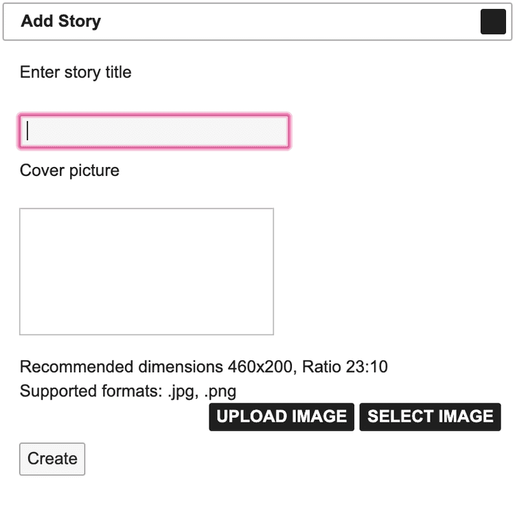
For rectangular covers, the recommended image size is 460px by 200px.
There is no required safe area for these story image types.
See your existing stories
The Stories area in the CMS displays a list of your existing stories, including information about each one:
- Draft or Current list of stories
- Preview of the cover image
- Scrolling preview of the cards in a selected story
- Story title
- Cards - the number of cards in the image
- The date published.
- The date on which the information is true.
Add a new Story
When you add a new story, you do so by creating a new draft. When you're happy with the new story, and its content, you can publish it or schedule it to be published in the future.
To add a new app story:
- On the App Stories screen, click Draft. The draft screen is displayed.
- Click Add story.
- Enter the required details in the Add Story form:
- On the Story Details screen, click Add Story Card.
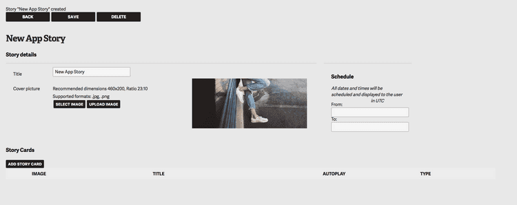
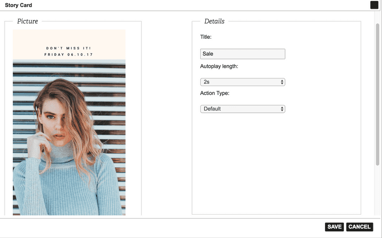
- Add the card details:
- Image for the story card, using the guidelines shown. Recommended ratio is 16:9
- Title of the card.
- Autoplay length for this card - the length of time the card is displayed on the screen. Default time is 4 seconds, maximum is 30 seconds.
- Action type - link to a category, product, video or weblink.
- Complete the required details for your chosen action type.
- Click Save. You can now add further story cards until your story is ready to publish.
- Continue to add story cards until your story is complete.
- Use the date picker in the top right of the screen to schedule publications dates of your story. If you leave these blank, the story will be published indefinitely.
- In the Draft screen, click Publish.
Story card action types
You can choose different actions that your customer can perform to interact with your story.
Default
Selecting the default action type means the card will have no actions for your customers and will simply show the story card.
Category
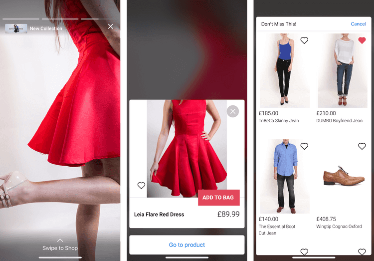
If you choose a Category action type, your customers can swipe up to see the range of products in your chosen category.
From this view, they can tap to see the product list screen for the category.
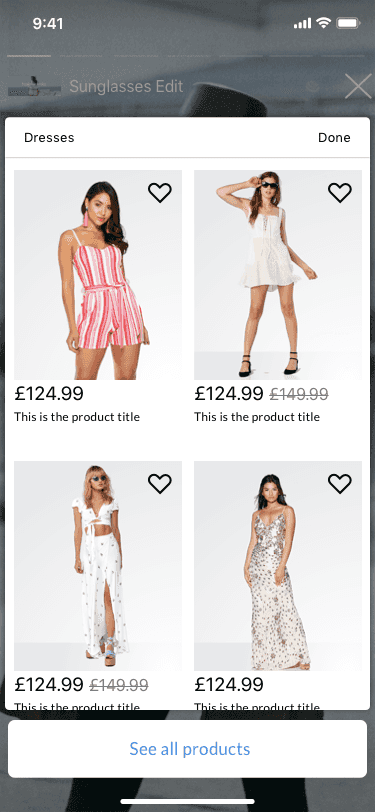
To add a Category action type to your story card:
- In the story card details form, select the action type Category from the dropdown list.
- Enter an instruction in the Action label field. For example, Swipe up to shop. You have a maximum 20 characters for this label.
- In the Category table, search for your required category by name.
- Select the required category from your search results.
- Click Save.
Product
The Product action type allows your customer to swipe up to see a list of individual products you have selected.
To add a Product action type to your story card:
- In the story card details form, select the action type Product from the dropdown list.
- Enter an instruction in the Action text field. For example, Swipe up to shop. You have a maximum 20 characters for this label.
- In the Products table, search for your required products by name.
- Select the required product from your search results.
- Click Save.
Weblink
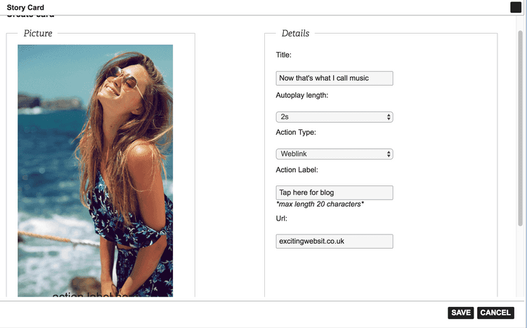
Add a Weblink action type to create a link to a website. This will be opened within your app as a webview.
To add a Weblink action type:
- In the story card details form, select the action type Weblink from the dropdown list.
- Enter an instruction in the Action label field. For example, Tap for our blog. You have a maximum 20 characters for this label.
- In the URL field, add the web address.
- Click Save.
Video
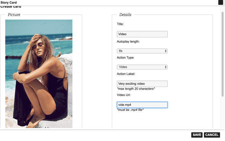
Add the video action type to add an MP4 video to your story card. Customers swipe the card and the video automatically plays in a full-screen, native player.
To add a Video action type:
- In the story card details form, select the action type Video from the dropdown list.
- Enter an instruction in the Action label field. For example, Swipe for video. You have a maximum 20 characters for this label.
- In the URL field, add the location of the MP4 video.
- Click Save.
