3 min read
Store Finder
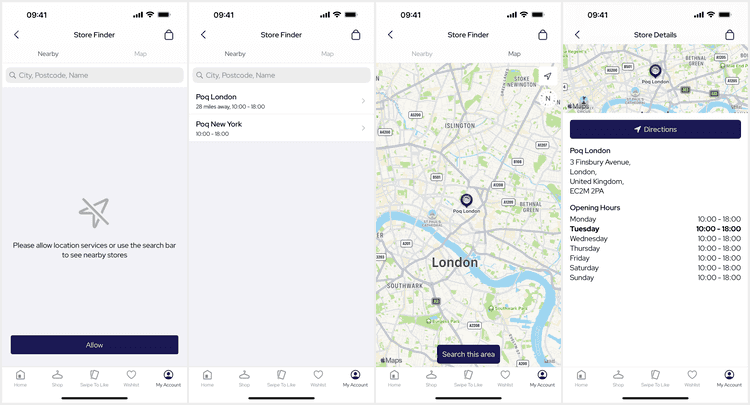
The Store Finder screen presents list and map tabs to allow the user to find a specific store. It also supports a single product for presentation and in-store stock.
Deeplinks
# Store Finderstoresstorefinder
# Store Finder (In-Store Mode)stores/in-store
Internally, the app uses navigation context to persist the product when navigating to this screen from the Product Details screen for Store Availability. It is not possible to deeplink to this screen for Store Availability or Selection.
Modes
The Store Finder can be presented in different modes; the standard mode being the base Store Finder.
A product can be sent to the Store Finder for Store Availability in any mode. When a product is sent the Store Finder presents the product and availability information using the Availability API instead.
Selection
The Store Finder can only be presented for selection by code. When in selection mode the Store Finder allows the user to select a Store and then tap a Select button to close and return the user selection to the owning feature.
In-Store
In-Store mode is almost the same as selection allowing the user to select a store. Instead of returning the store the user can Activate or Deactivate In-Store Mode for the selected store.
List Tab
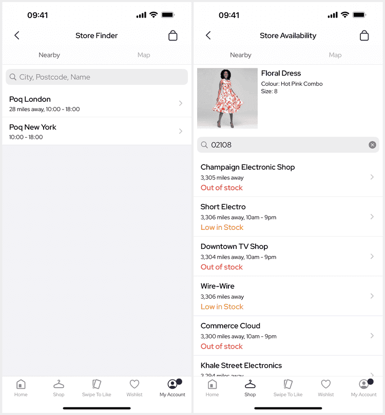
The nearby list tab presents a searchable list of stores ordered by distance to the user's location or as returned by the backend.
Product
The product card, at the top of the list tab, will show for Store Availability. Each store listing shows the stock availability information for this product and the Store Finder uses the Availability API instead.
Location Access
When first landing on this screen the user can decide to allow location access. Allowing access will refresh the list and present nearby stores.
This also enables the user tracking button and zooms to initially focus the user on the map tab. Moving the map unlocks this focus.
The title, message and action text can be customised by adding the matching StoreFinder.Error.Location.{thing} localized string to your app.
Alternatively, these can be customised via the StoreFinderViewDataMapper.
Search
The search bar is presented by default but is optional and can be removed if your backend does not support it.
Searching adds the q query parameter with the search string to fetch requests.
Some backends have specific search such as by 'postcode' only and so may require customisation.
To customise the placeholder string add the StoreFinder.List.Search.Placeholder localized string to your app.
To disable the search bar set it to nil when initialising the StoreListView via containers.
Stores
Store results are presented in the list with their title, relative location to the user (if allowed), opening time and stock information for Store Availability. Tapping a store will navigate to the Store Details screen for that store.
The title and subtitle text can be customised via the StoreListingViewDataMapper.
The store stock text can be customised via the StoreStockViewDataMapper.
Errors
When the app receives an error loading the user's location or the stores an error view is presented with an action appropriate to the error. The app shows errors returned in the body of failure responses.
If the error is to do with location the action may direct the user to allow location or to the iOS Settings app. Otherwise, the action will retry the failed request.
The action behaviour can be customised via the action and StoreFinderDelegate functions in the StoreFinderViewController.
The error title, message, image and action text can be customised via the StoreFinderViewDataMapper.
Pagination
The backend may be paginated so scrolling the list to the bottom can show a loading spinner whilst fetching the next page. If an error occurs this loading block will show a compact error view with a retry button.
Map Tab
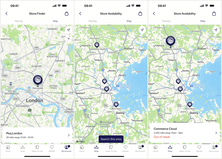
The map tab presents a map with the user's location (if allowed) and a search button to search using the current coordinates at the center of the map. Stores from all previous list or map searches will show on the map.
Search
The search button sends a separate action through the feature to request stores using the currently visible center coordinates. The backend may be paginated and be limited to some distance from the coordinates.
The button changes to a loading spinner whilst fetching stores and errors are presented as toasts.
The error toast behaviour can be customised using custom storeFinderAlert middleware.
The underlying search behaviour is quite complex as it is shared by the list screen throughout the redux components. The reducer handles merging all store responses into either or both the list and store results of the state.
Stores
Tapping a store annotation on the map presents a details panel instead of the search button. Tapping again on the map somewhere else deselects the annotation and hides the panel.
Store annotations can be customised via the StoreAnnotationViewDataMapper which is also shared by the Store Details screen.
You can specify different colors and images per store via the mapper using the view data style property.
The details panel shows the same information as the stores on the list tab. Tapping the panel will navigate to the Store Details screen for that store.
User Location
If the user allows location the map shows the system user tracking button to focus and follow the user on the map. When the user allows access, or visits the map the map will be centered on the user's location. Moving the map removes focus from the user.


