5 min read
Catalogue context
The catalogue context contains the most fundamental elements for the shopping experience. From adding your catalogue of products using a product feed, to product screens and product lists, and enabling searching and filtering.
In the Catalogue context:
- Catalogue feed integration - FTP
- Catalogue feed integration - Magento
- Catalogue feed integration - Salesforce Commerce Cloud
- Product list screen (PLP)
- Product details screen (PDP)
- Search & filter
- Visual search
Catalogue feed integration
Your Poq app uses feed integrations to get data about your products and stores to display to your customers. This can be done using a feed file, which you create and maintain, and Poq accesses via an FTP solution.
You can also integrate your products and store information through Magento 2 or Salesforce Commerce Cloud.
### Customer perspective
Your customer experiences the catalogue integration as details on the Product description screens or the Product list screens. They can also navigate your products using filters and categories using information you include in your feed.
What can be included in your product feed
Use this table as a guide to what can be included in your product feed.
| Name | Required | Description |
|---|---|---|
| id | Yes | A value that uniquely identifies each product. The ID does not have to be unique to each record in the feed. More than one sizes of the same product can share the same ID. |
| categoryname | Yes | When categoryid field is present, the depth of the category names must be equal to the number of category ids. (e.g. "Shoes; Sale>Men>Exclusive; Sale>T-shirt") |
| description | Yes | Please add a long description here. Include materials, specification, size, fit information and so forth in this field. Line breaks and double spaces are carried over. Please escape all double quotation marks. |
| name | Yes | Used as the main product title on product listings and the product details page. |
| parentproductid | Yes | Is used to group variations of the same product. Entries with same 'parentproductid' are grouped together and displayed as one product. Most commonly used for grouping together product sizes. Products with different colours must have different parent product ids. |
| pictureurls | Yes | Contains a semicolon-separated list of picture URLs. Please provide the highest resolution (minimum 500×500 pixels, 1500×1500 is recommended) pictures available. |
| price | Yes | Price of the product before any discounts. |
| sku | Yes | Must be an identifier unique to each unit that is sold independently. We will use this value "as-is" when referring to the product variation when interacting with your system. |
| categoryid | Depends | This field is required only when there is an API/Merchandising integration to list products belonging to a specific category, so it can be looked up by ID. The field contains one or more categories. Categories are semi-colon separated and category levels are separated by a greater sign. (e.g."1; 5>32>33; 5>34") |
| brand | No | Used for filtering the products by brand. |
| colourgroupid | No | Groups different products with the same colour or style together. It could be a unique number, product code, colour code, url, etc. For instance, if a single sized product comes in two colours, the two SKUs of this product should have the same colourgroupid but a different colourname. Multiple SKUs of the same colour of the same product should share both the colorgroupid and the colorname. |
| colourname | No | Contains the name of the colour of a product. (e.g. "Navy Blue", "Light Cream") |
| colourswatch | No | A URL to an image to be used to show a colour icon on the product details page if the product has other colours. When not present, a smaller version of the lead image is displayed instead. |
| delivery | No | |
| ean | No | European Article Number, often used to transfer barcodes. |
| isinstock | No | The following values indicate a product is in stock: "true", "1", "in stock", "" (empty). Any other value indicates otherwise. When not provided, all of the products are assumed to be in stock. |
| quantity | No | The stock level of the particular item. Is used for low stock indicator. Is not used to determine whether a product is in stock or not. |
| producturl | No | A full link to the product page, including the https schema portion. |
| promotion | No | Can be used to provide a text string, to be displayed on the PLP screen as a product promotional banner. For example, 'New In' , 'Sale', 'Special Offer' indications within each product cell on the PLP. Please ensure that the value passed fits within the promotional banner area. |
| returns | No | |
| size | No | Determines the text used to display the size. (e.g. "XL", "Small", "12") |
| sortindex | Depends | Required when the 'categoryid' is present. Defines the order of the products in a category. The number of indexes must be equal to the number of category ids. (e.g. "1;45;3") |
| specialprice | No | Discounted sales price. When present 'price' is used to display old price. |
| style | No | Used for filtering the products by style. One style value per product is allowed. |
| videourl | No | The full link to the product's video file, including its extension. You are responsible for hosting the video file. Only MPEG-4 videos (extension .mp4) are supported. |
| Additional Information | No | To be used for custom features, you may add additional product information (such as product ratings). This is achieved by adding additional columns and values to the file. |
Shop menu
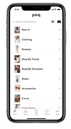
The Shop menu is where your customer begins their shopping process as if they were entering a physical store. They can use the search functions here or browse by category.
Customers perspective
Customers can access the Shop menu from the Tab bar at the bottom of the screen. The main use of this screen is for your customers to access and navigate your categories.
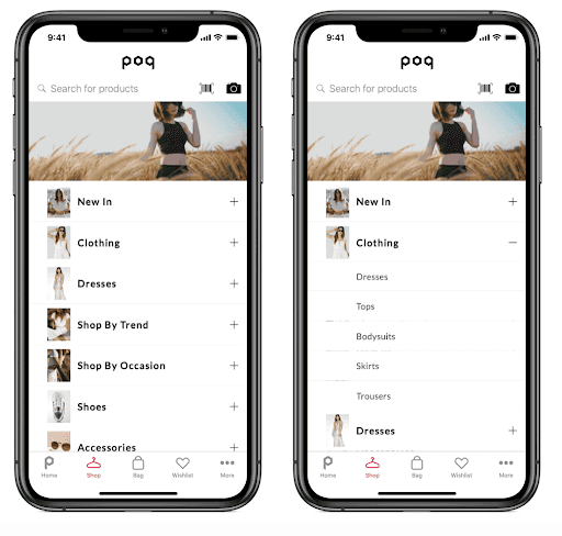
They can navigate through the categories using either the Accordion menu or Sliding menus. These methods both work in intuitive ways, but categories and products expand differently.
Accordion menu
The accordion menu expands downwards when your customer taps a category title.
In the below example, you can see that the top category Clothing has been selected, and the subcategories:
Sliding menus
In a Sliding menu, the subcategories slide out to a new screen. Each time a category is selected, a new screen appears.
In the example below, you can see that the top category Dresses has been selected to reveal a screen of Dresses subcategories.
Configuring categories in the Shop menu screen
Categories are implemented using the product feed, using a Parent > Child relationship between categories and their subcategories.
For example, within the category Shoes, you have several subcategories, which become more specific. Here is a typical route for Men's Nike trainers:
Shoes > Men's shoes > Trainers > Nike.
Using the feed you can:
- Name the categories and subcategories.
- Link categories with subcategories.
- Define an image to be displayed alongside the Top category list item.
Product List screen (PLP)
The Product list screen (PLP) appears when your customer reaches the final subcategory of products, when they have performed a search or tapped a link from a Banner, Story or Lookbook that has a list of products as its destination.
Customers perspective
This is one of the most important screens in the shopping process. Here your customer can:
- Tap a product to see more details.
- Tap the Wishlist icon to add the product to their wishlist.
- Access filters to adjust the products they can see according to:
- Price.
- Colour.
- Size.
- Category.
- Brand.
- Style.
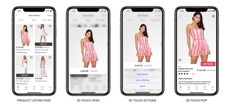
- Force touch to enable peek and pop - the image pops out when your customer presses slightly harder on the product. (iOS 6 and later).
- Force touch swipe up to access - the image pops out when your customer presses slightly harder on the product. (iOS 6 and later).
Anatomy of the PLP
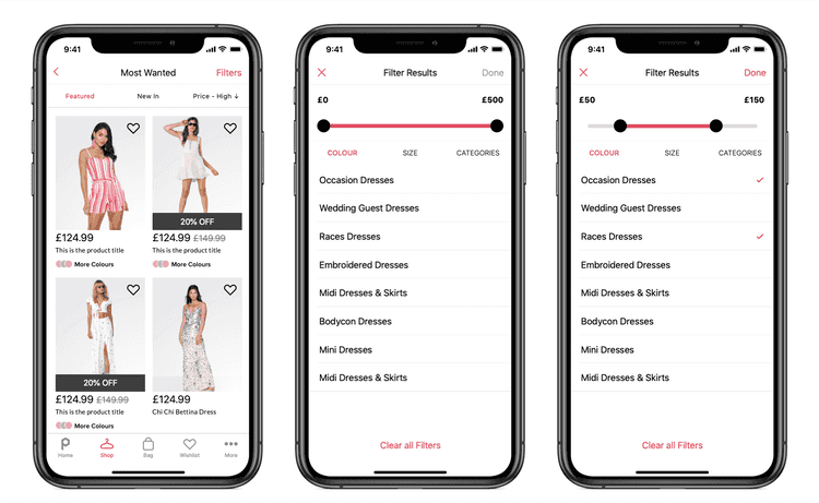
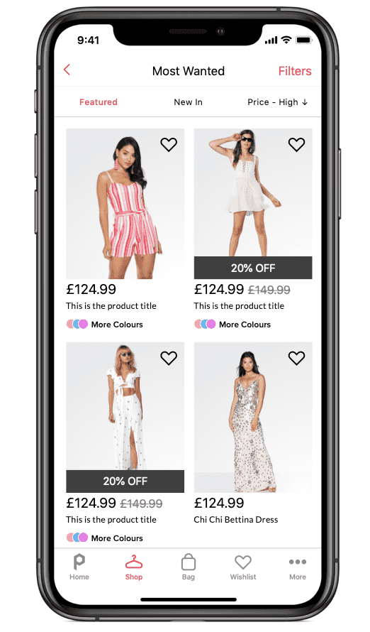
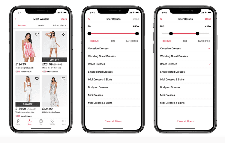
The PLP is a presented as two columns of product information, which scrolls down to a maximum of 24 products. The height of each listing is fixed.
Each Product displayed has:
- An image.
- Price.
- Name.
- Wishlist icon.
- Colour.
- Discounted price and previous price.
- Placeholder if no image is available.
### Filters in the PLP
Your customer can access filters from the top right of the screen. In the filters settings they can choose the filters they want from an automatically populated list of available filters. This means your customer only sees the filters that are relevant to the products already in the PLP.
Configuring your PLP
Products, categories and filters all take their definition from your product catalogue feed. If you want specific products to appear in specific categories, you can do this by adjusting your feed.
The PLP screen itself can be customised using the Catalogue Context of the Poq SDK. Using the SDK, a developer could, for example, add more information to the PLP product information.
Product detail screen (PDP)
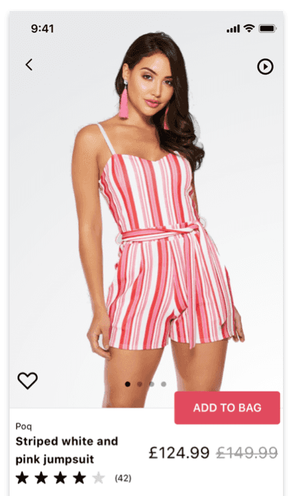
The Product details screen is the main source of information about each of your products. This includes larger images than the PLP, which can be presented in a carouselif there are more than one.
The PDP is split into Above and Below the line, offering your customer an intuitive navigation to see expanded details of the product they are interested in.
Customers perspective
Your customers can access the PDP for a product directly from a Banner, Story, Lookbook or PLP item (including in the results of a search or filtered PLP).
Once on the PDP, they can see a range of information before needing to scroll down for more. The way the information is arranged for your customer is intentional and helps them to get access to the most important details first, before allowing them to read on at their leisure.
Anatomy of the PDP
The division is known as Above and Below the fold.
#### Above the fold
Above the fold the customer sees:
- Product image carousel - customer swipes to move to the next image.
- Video player icon - if video is included in the product feed for this product.
- Add to cart call to action button.
- Wishlist icon - single line outline means they can add to wishlist. Filled icon means it is already in their Wishlist and can be removed.
- Discounted price and original price.
- Title.
Below the fold
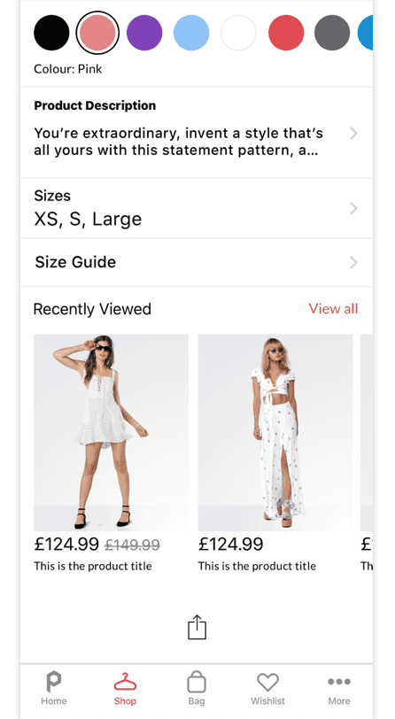
What the customer sees below the fold is decided partly by your catalogue feed. For example, not all products come in varying sizes, and so don't require access to the size guide. Typically the information included is:
- Available colours.
- Product description (Required in the feed) . Shown as a line of intro text which can be expanded for fuller description.
- Sizes.
- Access to the size guide.
- Delivery and returns policy.
- Recently viewed carousal.
Configuring your PDP
Products details, images, video and video cover images all take their definition from your product catalogue feed. If you want specific products to appear in specific categories, you can do this by adjusting your feed.
The PDP screen itself can be customised using the Catalogue Context of the Poq SDK. Using the SDK, a developer could, for example, add more information to the PLP product information.
Search
Customers can search in your Poq app using text, barcode scan or, if you have it in place, visual search.
### Text search
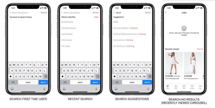
The most common type of search is a text search using the search bar. Customer searches are matched by keywords in the title of your products.
To help your customer find what they are looking for, predictive search suggests up to five previously searched categories.
Search results
Search results are presented in a PLP screen, which customers can then filter using the filter buttons as normal.
Barcode search
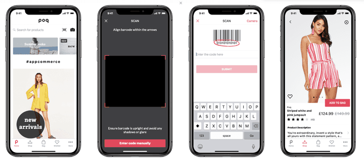
If your customer is in one of your physical stores, they can perform a search using their device's camera as a barcode scanner. The results tell them if the item they want is available via your app. This is a great way to offer customers a complete experience. If they size or colour item they are looking for isn't in store, they can check instantly if it is available via your app.
When available, your customer accesses the barcode search function by tapping the barcode icon in the search bar.
If their device has the required scan functionality, your customer can then scan a barcode, and the PDP of the matching product is displayed.
Because a barcode is a unique identifier for a product, the results are not shown in a PLP - there can be only one result.
Visual search
You can include visual search for your customers through one of our approved partners.
Your customer uses the camera on their device to take a picture of a product they like. This image is then matched to products in your catalogue, and the results are displayed in a PLP, just like a text search.
