7 min read
Components
Once you are happy with the configuration of your foundation elements, you can make changes to the way visual components are displayed in your app.
Generated Attributes
There are some visual elements chosen automatically by the Poq platform. These are shown for each component in the right hand column.
Buttons
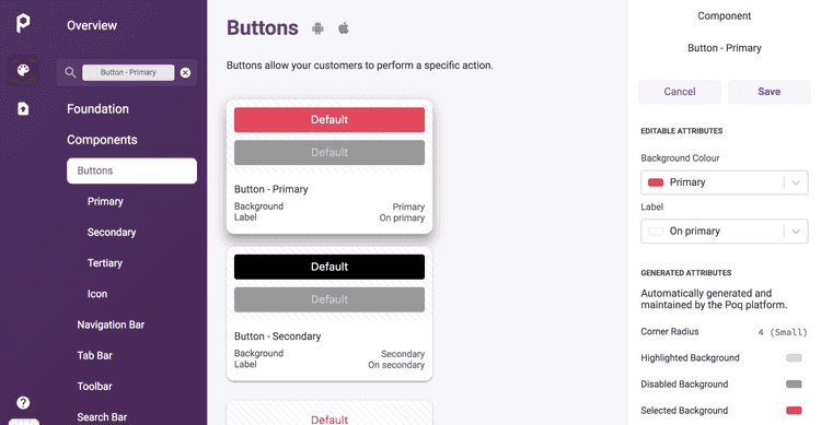
Buttons allow your customers to perform a specific action. The buttons in your app, by default, follow the colour hierarchy in your foundation styles.
To edit the appearance of a button in your app:
- From the Poq App Manager home page, select App Styler.
- Click Components in the left hand menu. A list of editable Foundation elements is displayed.
- Click Buttons.
- In the left hand column, choose which button you want to edit. For example, Primary. The selected button type preview is shown in the central column.
- In the right column, select the Background colour to choose the colour of the button.
- Select Label to choose the colour of the text on the button.
- Click Save.
Navigation bar
The Navigation Bar is a standard iOS component, it displays information and actions relating to the current screen. In iOS 11 and later, it has a large title style, which can be displayed before the customer starts scrolling through your content.
The colours for the button text and the background in your navigation bar are set by default in line with your app's foundation colour hierarchy. To edit the colours in your navigation bar:
- From the Poq App Manager home page, select App Styler.
- Click Components in the left hand menu. A list of editable Foundation elements is displayed.
- Click Navigation bar. The navigation bar preview is shown in the central column.
- In the right column, click the dropdown menu for Button Label to choose the colour of the button text.
- Select Background to choose the colour of the navigation bar background.
- Click Save.
Tab bar
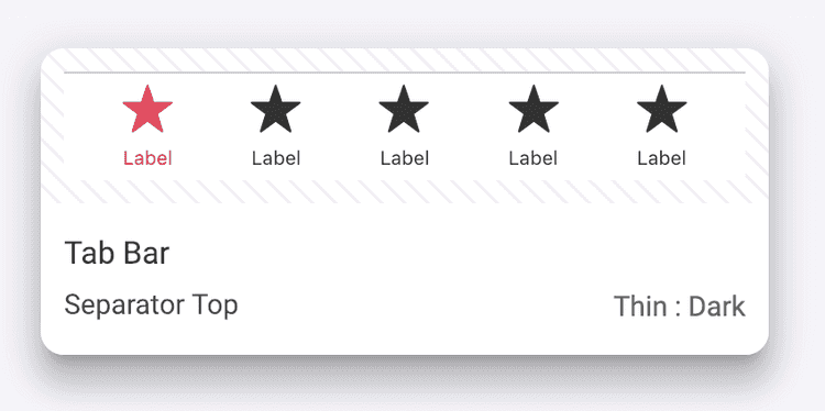
The Tab Bar is a standard iOS component, it provides the ability to quickly switch between different sections of the app.
The colours and opacity of the tab bar in your app is set by default according to your app's foundation colour hierarchy. You can change the colours for the following elements:
- Label when selected
- Label unselected
- Separator top
- Background colour
- Background opacity
To edit the appearance of the tab bar in your app:
- From the Poq App Manager home page, select App Styler.
- Click Components in the left hand menu. A list of editable Foundation elements is displayed.
- Click Tab bar. The tab bar preview is shown in the central column.
- In the right hand column, click the dropdown menu of the element you wish to edit to change the colour.
- Click Save.
Toolbar
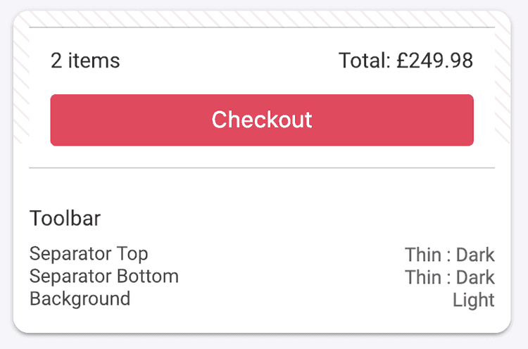
The Toolbar is a standard iOS component, it is simply a container primarily used for buttons to perform actions in the context of the current screen, it is also used to contain status information, such as when the content being displayed was last updated.
The separators and background colour of the Toolbar in you app can be adjusted between light and dark tones.
To edit the appearance of the Toolbar in your app:
- From the Poq App Manager home page, select App Styler.
- Click Components in the left hand menu. A list of editable Foundation elements is displayed.
- Click Toolbar. The Toolbar preview is shown in the central column.
- In the right hand column, click the dropdown menu under Separator top to choose the colour of the top separator.
- Click the dropdown menu under Separator bottom to choose the colour of the lower separator.
- Click the dropdown menu under Background colour to choose a light or dark colour for the background.
- Click Save.
Search bar
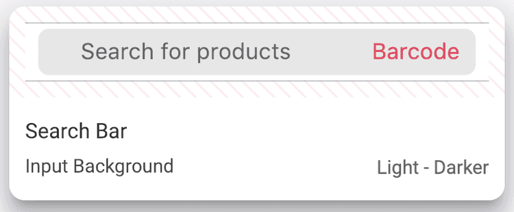
The Search Bar is a standard iOS component which allows customers to search for products in your app from any screen. Your app features a customised search bar with additional buttons for quick access to barcode and visual search.
You can only edit the background colour of the input field in your search bar. The rest is set by the Poq platform according to your foundation colour hierarchy.
To edit the appearance of the search bar in your app:
- From the Poq App Manager home page, select App Styler.
- Click Components in the left hand menu. A list of editable Foundation elements is displayed.
- Click Search bar. The search bar preview is shown in the central column.
- In the right hand column, click the dropdown menu under Input background to choose the colour of the background of the search bar's input field.
- Click Save.
Segmented control
Segmented Control is a standard iOS component, similarly to a small table of contents in a word document or traditional web tab bar, it makes the shopper aware of the top 2-4 sections/views for the content being displayed.
You can edit the colour of the segmented control menu for light or dark backgrounds.
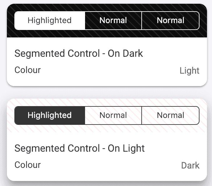
To edit the appearance of Segmented Control:
- From the Poq App Manager home page, select App Styler.
- Click Components in the left hand menu. A list of editable Foundation elements is displayed.
- Click Segmented Control. The Segmented Control previews for On light and On dark are shown in the central column.
- Select the Segmented Control panel for On light or On dark to edit its colour.
- In the right hand column, click the dropdown menu under Colour to choose the colour of the Segmented Control menu.
- Click Save.
Range slider
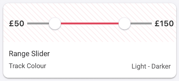
The Range Slider is a bespoke Poq component. Customers can slide two pointers to create a price range, which then filters the products they see.
You can edit the following elements of the range slider in your app:
- Track colour
- Selected track colour
- Track height
- Thumb colour - the thumb is the marker moved by the customer.
- Price label
- Price position
To edit an element of the range slider:
- From the Poq App Manager home page, select App Styler.
- Click Components in the left hand menu. A list of editable Foundation elements is displayed.
- Click Range slider. The range slider preview is shown in the central column.
- In the right hand column, click the dropdown menu for the element you wish to edit to select a new colour.
- Click Save.
Promo banner
The Promo Banner is a bespoke Poq component, it displays product-specific promotions.
Your app has both a primary and a secondary offer banner to add clarity when you have more than one offer for a product. For each type of banner, you can edit:
- Background colour
- Label colour
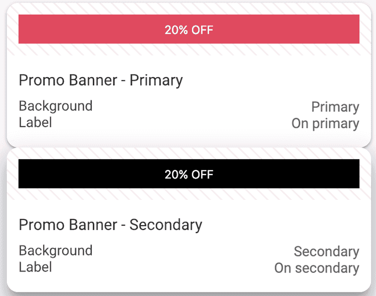
To edit the appearance of a promo banner in your app:
- From the Poq App Manager home page, select App Styler.
- Click Components in the left hand menu. A list of editable Foundation elements is displayed.
- Click Promo banner. The Promo banner previews for primary and secondary promotions are shown in the central column.
- Select the promo banner you require in the central column.
- In the right hand column, click the dropdown menu under Background colour or Label to choose a new colour for the required element.
- Click Save.
Pricing
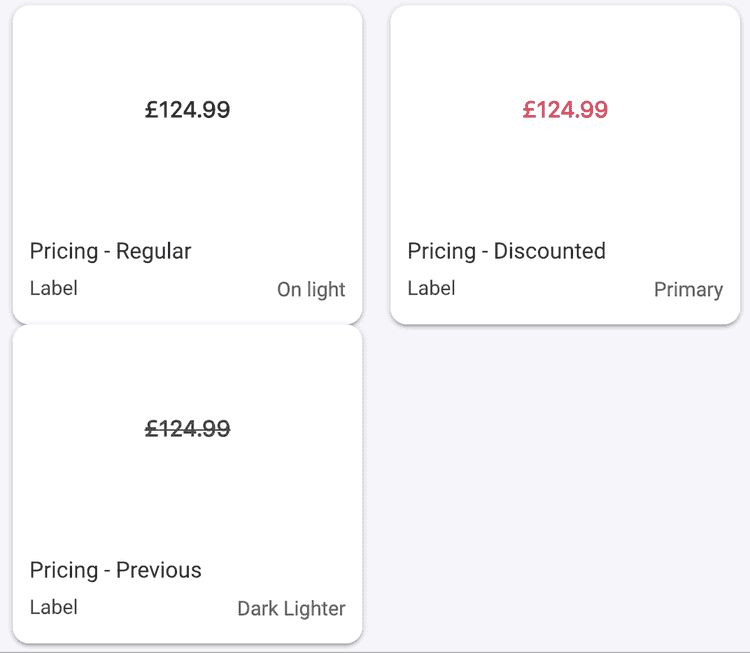
Pricing is a bespoke Poq component. This is how your product's prices are displayed on the screen.
You can edit the appearance of three different types of pricing:
- Regular price
- Discounted price
- Previous price
To edit the appearance of a pricing component in your app:
- From the Poq App Manager home page, select App Styler.
- Click Components in the left hand menu. A list of editable Foundation elements is displayed.
- Click Pricing. The previews for each type of pricing are shown in the central column.
- Select the pricing type you require in the central column.
- In the right hand column, click the dropdown menu under Label to choose a new colour for the required element. For example, a red for discounted prices.
- Click Save.
Table cells
The Table cell is a standard iOS component. Like the Navigation bar it's used in virtually every screen.
The Table cell itself is a container, similar to the Toolbar, with a range of uses, such as building forms, and listing products without creating a grid.
Because of its common use and versatility, there are many types of table cell you can edit in your app:
- Blank table cell
- Title and bottom button
- Title and disclosure indicator
- Title and checkmark
- Title and body
- Title, body, and disclosure indicator
- Asset, title, and disclosure indicator
- Asset, title, and accessory
- Title and price
- Detail and disclosure indicator
- Wishlist product table cell
- Cart product table cell
- Recently viewed table cell
To edit the appearance of a table cell in your app:
- From the Poq App Manager home page, select App Styler.
- Click Components in the left hand menu. A list of editable Foundation elements is displayed.
- Click Table cells. The previews for each type of table cell are shown in the central column.
- Select the table cell type you require in the central column.
- In the right hand column, click the dropdown menu under the element you wish to edit ****to choose a new colour.
- Click Save.
Page control
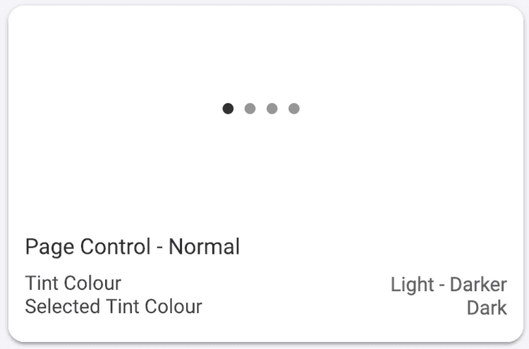
The Page Control is built-in iOS component. It displays the customer's current position in a series of screens, represented by dots. The dot representing the user's current page is darker than the rest.
To edit the appearance of page control in your app:
- From the Poq App Manager home page, select App Styler.
- Click Components in the left hand menu. A list of editable Foundation elements is displayed.
- Click Page control. The preview of your page control is shown in the central column.
- In the right hand column, click the dropdown menu under Selected colour or Page colour to choose a new colour.
- Click Save.
Media page view
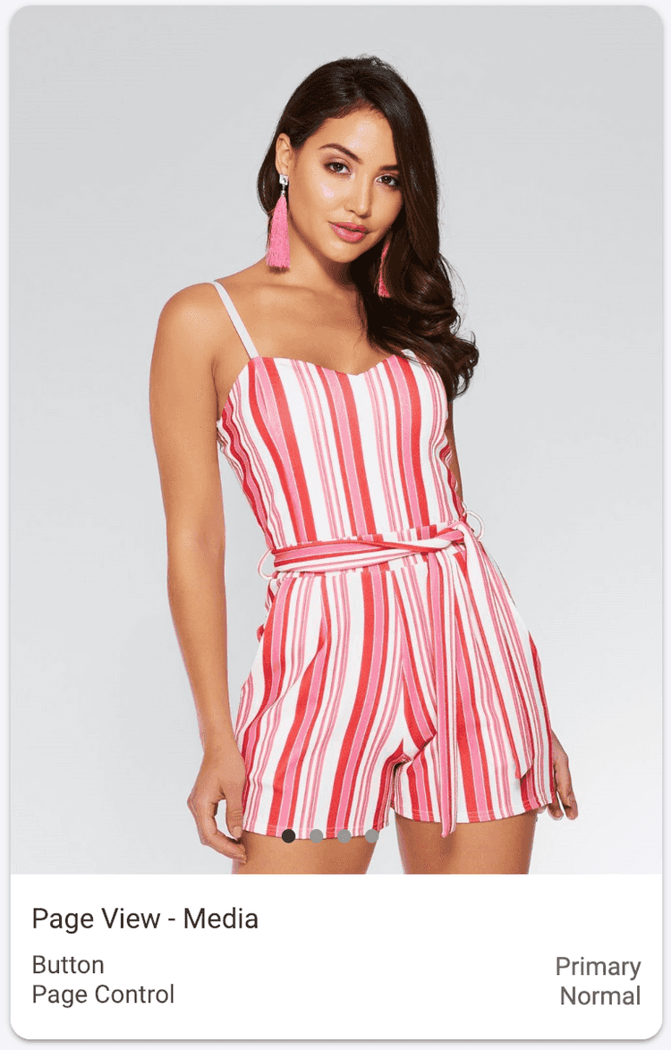
The Media Page View is a type of Page View and is a standard iOS component. In other platforms, it is also known as a carousel or paginated view. In Page View, customers can flick through multiple pages by swiping left or right.
You can edit the colour of the button and page control of your page view.
To edit the appearance of the media Page view in your app:
- From the Poq App Manager home page, select App Styler.
- Click Components in the left hand menu. A list of editable Foundation elements is displayed.
- Click Page view. The preview of your media page view is shown in the central column.
- In the right hand column, click the dropdown menu under the element you wish to change to choose a new colour.
- Click Save.
