2 min read
Cart
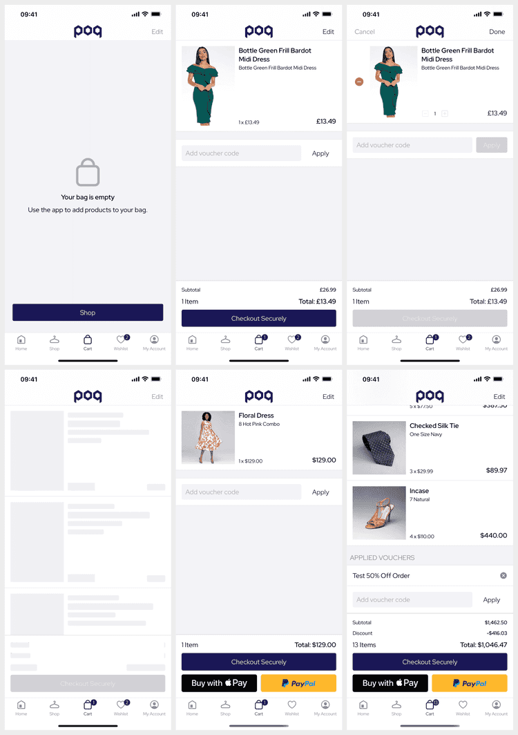
Cart is a core feature for most apps to allow the user to view, add items to, and edit their shopping basket.
Deeplinks
# CartcartbagNavigating to the cart will switch to the cart tab if the cart is a tab.
Set Up
The base Cart does not require set up.
Additional features such as vouchers must be enabled and may require BE work.
Dynamic Content
Cart supports the following Dynamic Content slots:
| Slot | Version | Where? |
|---|---|---|
scroll-top | v25+ | Before all scroll content, not in edit mode. |
scroll-bottom | v25+ | After all scroll content, not in edit mode. |
Adding new slots within the table is easy but shouldn't be necessary.
Navigation
The Cart is presented as the middle tab by default but can be reconfigured to the navigation bar. This is useful to instead show a more engaging feature such as Swipe to Like as the middle tab.
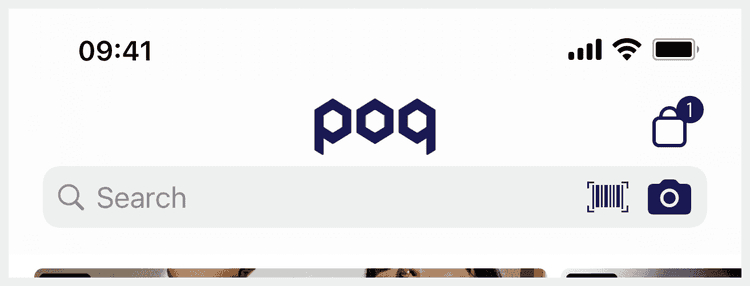
When adding items to the Cart a snapshot of the item is animated to the location of the button and the count badge increases. The badge is updated as often as possible but can be out of sync until the user visits their Cart.
Edit Mode
The Cart can be switched into edit mode allowing the user to adjust quantities and hiding distracting UI elements. When done edits are sent in bulk to the BE to update the Cart.
The user can swipe to delete or wishlist items regardless of edit mode.
Vouchers
Vouchers are easy to enable (disabled by default) but require BE support. When enabled the user can add vouchers whilst not editing the Cart.
Vouchers can be quite complex; they can have multiple 'promotions' or be incomplete until their requirements have been met by the current Cart. From SS25 vouchers are presented as capsules that better present this.
Express Checkout
Express checkout widgets require additional API or external integrations.
With AW24 express checkout widgets are made consistent using the Checkout API to mutate the Cart. The poq platform supports express checkout widgets from the following payment providers:
It's best to limit the number of express checkout widgets available to one (Apple Pay) or two.
Shipment Levels
The Cart supports 2 shipment levels to support BOPIS. These are not limited to BOPIS but a small amount of customisation is required to add other interesting methods.
The .checkout level changes the Cart and PDP Cart Widget to present shipment availability banners.
The app defaults to a BOPIS specific banner but this can be customised to present alternate shipping eligibility.
With this level the user should expect to be able to change shipment type at checkout.
The .item level changes the Cart and PDP Cart Widget to present interactive shipment selection per item.
The user is able to switch between available shipment options which updates the PDP stock focus.
With this level the user should expect to be able to set different shipment types per cart item.
History
- SS25: Reworked voucher UI to simplify and support incomplete vouchers.
- AW24: Reworked most express checkout widgets to use the Checkout API.
- v25: State architecture rewrite, BOPIS (shipment levels) and slots.
- v22: Added support for Cart Vouchers & Promotions.
Links
- Screens & Widgets

