2 min read
Foundation elements
Before configuring the style of the components in your app, you should establish the foundation elements. These are your colours, fonts and brand logos.
Foundation elements are the most visible and constant design elements in your app. Once you have edited these elements, you will be able to choose how they are used in each component.
Colours
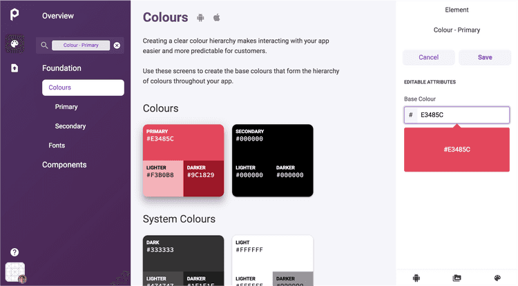
Your app uses a hierarchy of colours to create an intuitive visual structure to your screens. Primary colours are used for more prominent features, such as primary buttons. Secondary colours are more often used for secondary actions.
To set the primary and secondary colours in your app:
- From the Poq App Manager home page, select App Styler.
- Click Foundation in the left hand menu. A list of editable Foundation elements is displayed.
- Click Colours. A screen is displayed with Primary, Secondary and System colours.
- Click on the Primary colour. The menu on the right shows the elements you can change under the heading Editable attributes.
- Click the colour picker and enter a hexadecimal colour value.
- Click Save.
- Click on the Secondary colour, and edit in the same way.
The hexadecimal colour format can be a 6-character value like #E3485C or an 8-character AARRGGBB value like #FFE3485C, which supports an alpha channel using the first two digits.
Typefaces
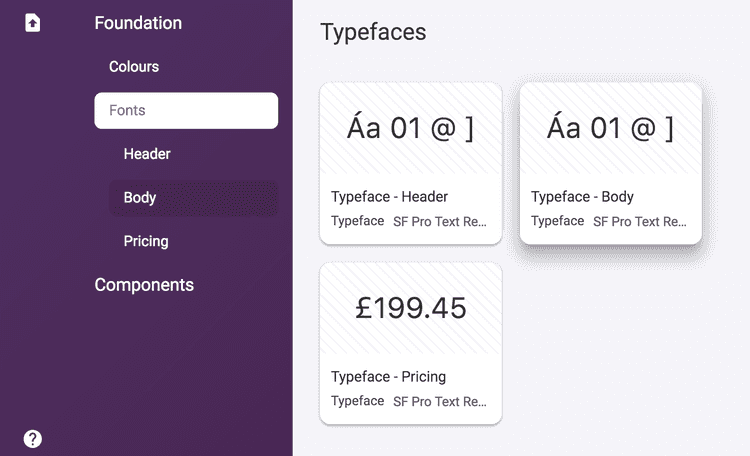
Each text element in your app uses a specific typeface. You can upload any .ttf or .otf font file for Headers, Body copy and Pricing text. For each main category of text, your chosen font will be used in the following elements:
- Headers:
- Large title
- Title 1
- Title 2
- Title 3
- Headline
- Body copy
- Body
- Callout
- Subheading
- Footnote
- Caption 1
- Caption 2
- Pricing
- Regular price
- Previous price (strikethrough)
- Offer price
The size and weighting for each text element is selected automatically by the Poq platform.
To edit the foundation font in your app:
- From the Poq App Manager home page, select App Styler.
- Click Foundation in the left hand menu. A list of editable Foundation elements is displayed.
- Click Fonts. The default or currently selected typefaces in use are displayed in the central column.
- Click Header to add the typeface for your Headers.
- In the right column, add the .tiff or .otf file for Regular, Semibold, and Bold text.
- Repeat the above steps for Body and Pricing typefaces.
Other assets
As well as icons, you can change other visual assets in your app, including your company logo.
To edit other assets:
From the Poq App Manager home page, select App Styler.
Click Foundation in the left hand menu. A list of editable Foundation elements is displayed.
Click Assets.
The icon assets that you can change are displayed in the central column.
Scroll down through the icons until you reach the heading Other.
Click on the asset you wish to edit, for example Brand logo.
In the right column, click the dropdown list to select or upload .svg icon file to use for this icon.
Click Save.
Repeat these steps for any other assets you wish to change.

