12 min read
Content in your app
The content context contains all the screens your customer encounters as content. This includes banners, visual stories, look books, images, the onboarding experience and written information about your brand.
The content you add into your app is what makes it a rich experience for your customer. Within your app, your content is uninterrupted by the external factors of a website. There are no tabs here back to social media or other distractions.
The more quality content you add, the richer your customer’s experience becomes.
Features in this context are:
- Onboarding
- Banners
- Stories
- Lookbooks
- Pages
- Design assets
Onboarding screens - entering the world of your app
Whenever your customers open the app for the first time, they see your onboarding screens. These screens create the mood and set the tone for what your customers can expect. They are a way of entering the world of your app - which, unlike a website, is free from external distractions.
Customer perspective
Customers don't interact directly with your onboarding screens, but they can use the 'Get Started' button to see any features you use your content to highlight. While they should make an impact, a light touch can make the most of your onboarding screens.
The anatomy of onboarding screens
Onboarding screens are comprised of several factors:
- Title (not visible to customers) - The title of your onboarding screens are used for data tracking and analytics.
- Order of appearance - When you have multiple screens in your onboarding sequence, you can easily arrange them in any order you choose.
- Background colour - if you use an image that doesn’t take up the entire screen, you can enter the hex code of the colour you want to use as the background colour.
- Banner image - a large image that you upload to the CMS as a banner.
- Get started button - a button with a consistent call to action that can be linked to a specific screen in your app.
Adding and configuring your onboarding screens
When adding and editing your onboarding screens, you can:
- Choose and adjust the dates the screens are live.
- Make the onboarding screens visible or not visible to customer.
File types required for your onboarding screens
Each screen in your onboarding is a static image file. This means that even text-only screens need to be uploaded as an image of your text.
Image files accepted: .jpg, .png
### Analytics The title you give your Onboarding sequence will be used in analytic tracking of your banner. Each time your customers tap on a banner, an analytics event can be triggered.
Banners
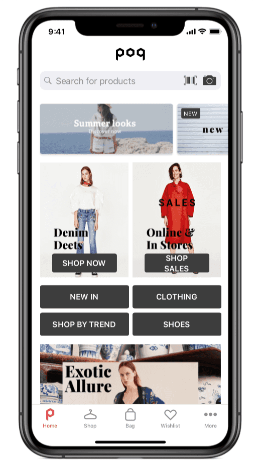
A banner is an image or gif that your customer can interact with. Typically, banners are used to advertise products within your app. A banner can be linked to product pages, category lists, web content or other pages in your app.
Customer perspective
Banners appear on the Home screen - the first interactive screen your customer sees when they start the app. They can be used to tell the customer about sales, new products, trends and any other information you want to give them.
Although the actual file you upload to create a banner is always an image, you can present the customer with text, images, and combinations of the two. You can also present them with moving image Gifs.
The banner can be seen as the start of a journey in your app, the customer taps a banner they are drawn to, and are taken to a new screen to continue shopping or learn about a new product or trend.
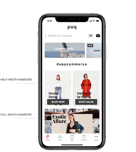
You can have multiple banners on your home screen, each with varying heights and taking up either 50% or 100% of the width of the screen.
You can choose the order in which they are arranged, and the dates they appear to your customers. Anatomy of a banner Banners seen by your customers are comprised of several factors:
- Title - used for accessibility and analytics.
- File - the image file that customers see.
- Publish date - the period of time during which your banner is live.
- Platform - the platform you want the banner to appear on.
- Banner size - your banner can take up either 50% or 100% of the width of the screen.
- Visibility - whether your banner is hidden or visible to your customers when it’s live.
- Link type - the destination of the link in your banner. For example, a product details screen (PDP).
- Padding - the space around your banner on the screen.
Adding and configuring your banners
The banner’s main function is to grab your customer’s attention and lead them to content or products that you want them to see.
You can control and configure all the important visual elements of your image to ensure it looks right on the screen, and takes your customer to the right place. You can also schedule your banners to appear at the right times, and get a preview of future states.
Drafting, publishing and scheduling your banners
When you add or edit a banner, you work on a draft first, before publishing the banner. Once published, the banner goes live on your chosen live date.
File types
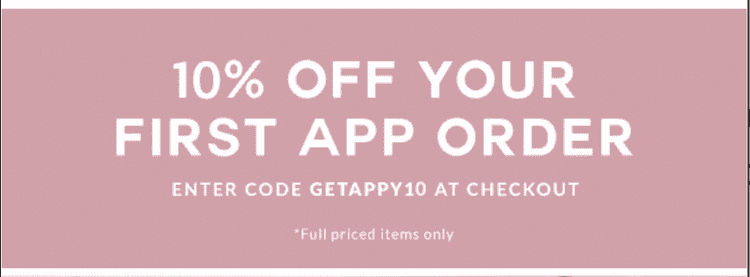
A banner is always either a static (jpg) or moving image (gif) file. To add a text-only banner, you can upload an image of your text.
This is an example of a text only banner, presented as a .png image file.
Files for different screen sizes and platforms
You can upload a different file for iPhone, iPad and Android. This allows you to create higher resolution banners for bigger screens. Draft and published states Whenever you add a new banner, or edit an existing banner, you work on it in a draft state. This means it is not yet published, and cannot be seen by your customers.
When you are happy with the banners in your draft state, you can choose to publish. Once banners are in a published state, they will appear to your customers on their scheduled dates (including those that are to be published indefinitely.)
Publication dates
You can set the publication dates for each banner, allowing you to schedule the banners on your home screen throughout the year.
History view
You can view the published banners for a given date in the past or planned in the future based on the settings in your banners. This allows you to effectively plan your schedule, and easily see which banners were live on a certain date.
Analytics
The title you give your banner will be used in analytic tracking of your banner. Each time your customers tap on a banner, an analytics event can be triggered.
App Stories
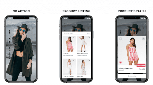
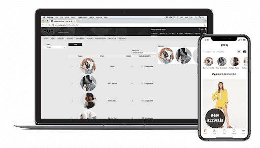
A story is a sequence of images that are shown in a fixed order, for a fixed amount of time. Your customers can interact with screens within the story, allowing them to see products, videos or other content.
Customers familiar with stories on Instagram and other social media services will recognise the concept of these stories, and are likely to know how to use the simple controls. Customers who are new to stories can quickly learn how to pause, skip back and tap or swipe to interact.
### Customer perspective
Stories appear at the top of the home screen - your customer can select the one they want to view, and the current screen is replaced by the story.
Your customer can choose to interact with each screen through intuitive responses.
The anatomy of an App Story
App Stories seen by your customers are comprised of several factors:
- Circular or square - Your app supports stories presented as squares (filing the entire screen) or circles (appearing in a circular ‘vignettes’ familiar from Instagram and other social media apps).
- Cover - The first image of the story, and the thumbnail image your customers select to view the story.
- Title - Displayed on the story cover, and used in analytics to track interactions with your story.
- Cards - The screens in the story that follow the cover.
- Card duration - The adjustable length of time each card is shown on screen.
- Progress bar - A visual representation of the duration of each card as it is played to the customer.
- Autoplay duration - The story duration is set to last between 1-30 seconds.
- Type of link - Each card can be linked to a Video, single or multiple product screen, or a website.
How your customer interacts with stories
There are different ways your customer can interact with and see your app stories:
- See unread stories - Stories are located in the upper area of the homescreen, below the search bar. Any unread stories are highlighted with a coloured line around the thumbnail image.
- Scroll through stories - Your customer can scroll left and right through the stories available. Your app supports more live stories than there is space for thumbnails on one screen.
- Start the story - Starting a story is easy, customers just tap the title thumbnail from the available list.
- See the cover thumbnail - The story cover thumbnail is visible for context throughout the story in the top left of the screen.
- Pause the story - By holding a finger on the screen, the story can be paused. This allows customers to read any text on the screen or look at the screen they are interested in for longer than the allocated time.
- Skip to the next card - By tapping the right side of the screen, customers can navigate to the next card in the story.
- Skip to the previous card - By tapping the left side of the screen, customers can navigate to the previous card in the story.
- Swipe up to shop - If you have added a product or products to your story interaction, your customer can swipe up to see a modal with an ‘Add to cart’ button, and a link to the product details page.
- Tap the card - Your customer can tap the screen as they view a card and be taken to a screen or website.
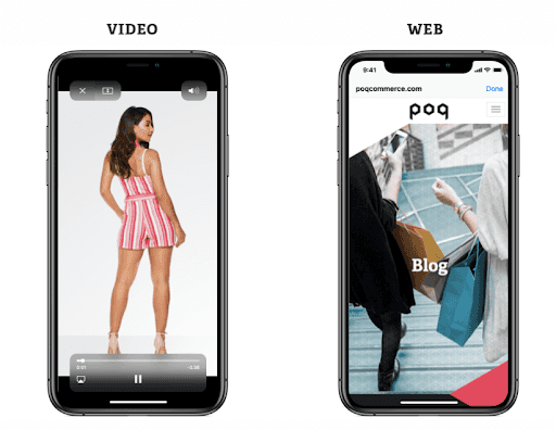
- Play video - If a card in your story links to a video, your customers can tap the screen to trigger the native video player.
- Close the story - By tapping the X at the top right of the screen, your customer can close the story and return to the home screen.
Adding and configuring your stories
When you add or edit an app story, you can:
Choose and adjust the dates the story is live.
Easily switch the story to be visible to customers or hidden when live. For example, if the story refers to products that have temporarily sold out, you can hide the story until stock comes back online.
File types required for your story
A card in your story is always either a static image file or a moving gif file. This means that even text-only banners need to be uploaded as an image of your text.
Image files accepted: .jpg, .png, .gif
Video files accepted: link to .mp4 file
Analytics
The title you give your banner will be used in analytic tracking of your banner. Each time your customers tap on a banner, an analytics event can be triggered.
Lookbooks - a visual stage for your products
A sequence of screens that your customer can browse to learn more about your products, and engage more with your brand. Lookbooks can be a way of showing your products in a real life setting, and telling a story. Unlike App Stories, which give a snappy, time-specific run through, customers can browse Lookbooks and explore the content you provide for them at their leisure.
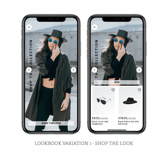
Lookbooks include interactions like hotspots that allow your customer to ‘shop the look’ or view individual products from the images they are shown.
Customer perspective
Customers access your Lookbooks from your home screen, below the banners and other content on this screen. Unlike App Stories, which progress on a fixed time sequence for each card, Lookbooks are controlled by the customer to run at their own pace.
Customers can take their time over each screen, and read more copy. They can swipe to continue through the carousel of screens. Where you have hotspots as well as tap any hotspots on the screen to see products.
### Anatomy of Lookbook
You can create two types of Lookbook:
- Classic Lookbook - a simple carousel of images (which can include text).
- Hotspot Lookbook - a carousel of images that can include multiple links, or hotspots, on a single image.
Each type of Lookbook is made up of:
- Title - The name of the Lookbook itself. This is displayed to the customer when they select a Lookbook. The title is also used in analytics.
- Image - A Lookbook is made up of multiple images. Even text displayed on a screen is added as an image file.
- Your chosen search term - Lookbooks can have links within them, either to individual products, or a range of products returned by searching a particular term. For example, you could have a screen with a link that triggers a search for ‘Blue chairs’ which will take your customer to the results screen for this search.
Customer interactions:
- View products - You can tap anywhere on a classic Lookbook screen to see a product of list of related products presented in the same way as search results.
- Hotspots - When enabled, your customer taps a particular point on the picture - represented by a + icon. This opens the product details in a small popover, they can then go to product details or add the product directly to their wishlist.
- Swipe to proceed and go back - Your customer can proceed to the next Lookbook card or the previous one.
- Swipe up to quit - On quitting the Lookbook, your customer returns to the Homescreen.
Adding and organizing your Lookbooks
When adding a new Lookbook to your app, you can:
- Add the images that make up your Lookbook sequence
- Select the order the screens in your lookbook appear.
- Set the location of hotspots using X Y coordinates.
- Create a destination product list that is linked to a lookbook screen.
Analytics
The title you give your Lookbook will be used in analytic tracking of your banner. Each time your customers tap on a banner, an analytics event can be triggered.
Pages - adding static content in your app
Pages are used throughout your app to present editable static content to your customers. You can use Pages to create any text-based content from forms to store opening times. You can also use the Pages editor to insert blocks of content within a screen.
### Customer perspective
Customers most often see your Pages content when they tap away from the main shopping processes. If they want to find out details of your delivery service, or see terms and conditions, they are taken to a screen that has been created as a Page of content.
### The anatomy of Page content
Pages are made up of blocks of content that you edit using a simple WYSIWYG (What you see is what you get) text and HTML editor.
Using this editor, you can create basic ‘blocks’ of content like text paragraphs, tables and forms. Your content can also include links to your website or anywhere else on the web.
The Page content you can create is divided into Types:
- Page - A page of content created using a standard text editor. Unless other blocks of content are used on the same screen, a Page takes up the entire space of a screen, and scrolls if necessary.
- Product category - A predefined content block that links to a product category.
- Hyperlink - A predefined content block that can link to any HTML URL. This opens up the webview within your app to display content from the web.
- Shop - A predefined content block that Opens up the Shop tab in your app.
- Lookbook - A content block that presents a list of Lookbooks to your customer. You can define which Lookbooks are included in this content.
- Storefinder - A storefinder Page, created by entering details of your stores in a preset form.
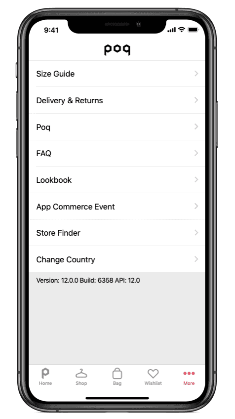
- Section header - A Header that is displayed in the More section of the app. This breaks up the screen and separates out content, rather than creating a feature.
- Separator - A predefined content block that places a blank horizontal space between two other blocks of content.
- Scan - A content block that activates the barcode scanner on your customer’s device, and displays the scanning screen in your app.
Adding and organizing your Pages content
Pages and content blocks are added and edited using a hierarchy of parent and sub-categories. You can create these parent or subcategory pieces of content, as well as use default options. This makes it easier to quickly create common types of content, like My Account pages. When adding and editing content using pages, you can:
- Select the order that content blocks appear on a screen.
- Delete old content and parent/sub-categories.
- See the hierarchy of a page.
- Schedule the dates during which the content will be published.
- Hide content or make it visible. As you edit, content is automatically set to be hidden, until you are ready to make it visible.
- Create parent pages and sub-categories which can be reused for future content.
- Set the content to appear on iOS, Android and iPad.
- Make the onboarding screens visible or not visible to customer.
### Analytics
The title you give your Page content will be used in analytic tracking of your banner. Each time your customers tap on a banner, an analytics event can be triggered.
Stores - show details and location of your physical stores
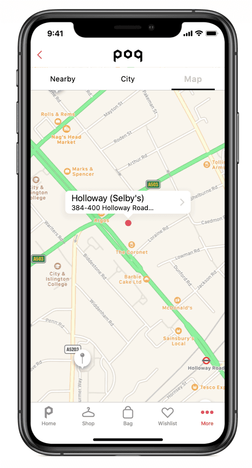
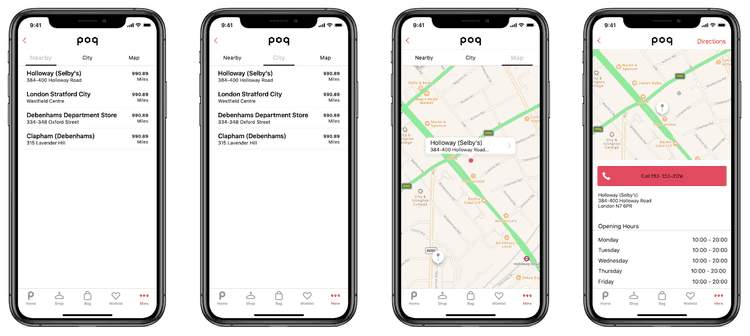
If you have physical stores, you can set up a list of their address, opening times and location on an interactive map using GPS. This resource allows your customers to easily find you and see their potential purchases in real life.
Customer perspective
Customers access your list of stores and store finder from the ‘More’ menu, located in the navigation bar at the foot of the screen.
They are prompted to allow your app to use their location. Once they have given this permission, a map is displayed, showing the customer’s location and nearby stores.
Anatomy of the Stores screens
The Stores feature is made up of:
- A text-based list of your stores and details of their opening times.
- Your stores locations on a map, generated using the GPS on your customer’s device.
Adding and organizing your Store screens
When adding a new store lists to your app, you can:
- Add address details.
- Add opening times.
- Enable map view.
