1 min read
Product list
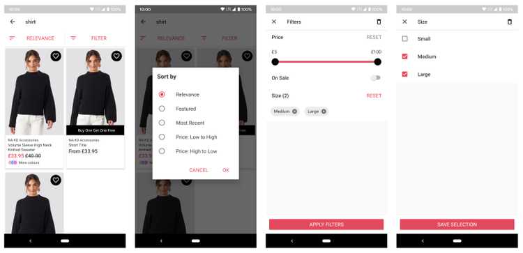
The Product list framework is where your customers can see a product list via a search or a category, sort the results or refine them with filters.
Without any customisation, your Product list framework looks like this:
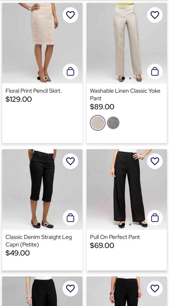
Product list SDK supports 3 feature flags, showMultipleImages, showFormPicker and showAddToCart. With all of them enabled, Product List screen looks like this:
Start using the Product list SDK
The platform module includes the Product List SDK. To start using it, you need to override the XML value useNewProductListAndNewCategories and set it to true. The Product List SDK is compose of these modules:
The most common customisations are described in this link.
Koin modules
The Product list dependencies are displayed in your app using Koin. Product List SDK provides the default dependencies definitions via these Koin modules:
productListDataModuleproductListDomainModuleproductListPresentationModule
Poq Settings
The Product List SDK is configurable via ProductListSettings and ProductListComponentSettings.
Through ProductListComponentSettings you can configure:
pageSize: it controls the size of the pagination page. In general, this only drives the amount of products prefetched initially (3 * pageSize) as backend controls the page size.
Through ProductListSettings you can configure:
productListSpanCount: the span count for the Product list adapterlistingSpanType: Defines the span type used in the Product List adapter. Defaults toMultiColumn. Available types are defined inListingSpanTypeproductListHeaderSpanCount: the span count for the Product list header linecustomSpanCount: span count for the custom itemloadStateSpanCount: span count for the loading more pages itemslotHeaderSpanCount: the span count for the Dynamic Content slot on the Product list headerlistingTemplate: it allows to switch listing templatesshowMultipleImages: if enabled shows a ViewPager on the listing items to see multiple images. False by default.showFormPicker: if enabled shows aFormPickerSmallImageViewon the listing items with Colour as default form to pick. False by default.showAddToCart: if enabled shows an add to cart button on the listing items. False by default.showListingSpanSelector: if enabled shows a selector that allows the user to switch the Product list from 2 to 1 one products for line. True by default.showReviewsCounter: if enabled shows the number of reviews next to the star rating. False by default.

