2 min read
Product List
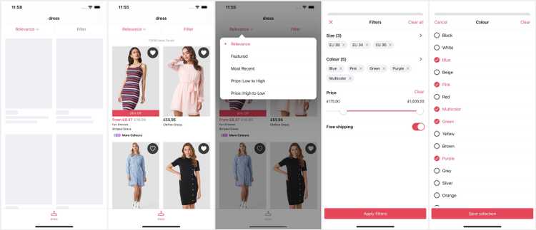
The Product List (PLP) is a core catalogue feature that uses the Search API to present product listing results for search queries, or categories. It surfaces dynamic filters and sort options driven by the API / feed.
From SS25, we use the iOS 18+ zoom transition to navigate to the PDP.
The Product List does not support Variant level wishlists because listings do not have variant information. The UI would also be disrupted by variant selection and the WishlistWidget wouldn't be able to represent whether the listing is wishlisted or not.
Deeplinks
# Search Resultsproducts/search/{query}
# Categoryproducts/category/{id}?title={title}
All parameters should be correctly percentage encoded (ex. spaces should be '%20').
Replace query with the search string.
# Recently Viewedproducts/recentlyviewed
# Specific Productsproducts?ids={pid,pid,pid}products?ids={pid,pid,pid}&external_ids={lid,lid,lid}
When using external_ids (listings) the number of ids should match.
Replace pid,.. and lid,.. with comma separated arrays of product and listing identifiers respectively.
Set Up
The Product List does not require any developer set up. However, additional features may need to be enabled by a developer.
The product catalogue image ratio should be set as part of app set up to preserve the right UI area for images.
Dynamic Content
The Product List supports the following Dynamic Content slots:
| Slot | Version | Where? |
|---|---|---|
scroll-top | SS24 | Before all other scroll content. |
Adding slots to a collection view is a bit more complex as cells do not know the size of other cells.
Style Switcher
From SS25, the Product List supports a new column style switcher that switches between larger and smaller cells. On iPhones this presents either 1 or 2 items per row, on iPad the numbers are slightly higher for the extra screen size.
Sort Options
Sort Options are dynamic, returned by the first response where categories can be set up with different default sort options.
If the response does not return a default sort option the Sort Order remains unselected until the user selects one.
From SS25, sort selection is handled by the toolbar view using an OS menu.
Variant Grouping
Product listings work with variant groups instead of variants. These are sets of variants grouped by common forms (ex. red variants, wooden variants...) that visually change the appearance of the product.
Product listings have a slot for a variant group view at the bottom. Prior to v24 this was a 'More Colors' view to indicate there are other looks of the product to the user. With v24 we default to a swatches view to allow the user to switch the appearance of the listing to a different variant group.
History
- SS25: Added style switcher and improved scrolling and loading.
- v25: Improved layout engine and added slot for Dynamic Content.
- v24: Added dynamic API driven sort options replacing hardcoded options.
- v22: Improved to self-sizing cells and fixed deeplink consistency.
- v18: Initial SDK release improving on the previous with dynamic filters.
