2 min read
Filters
Last Updated - Platform 24.0 - SDK 19.0The Filter Selection screen uses dynamic filters returned from the initial response from the API within the ProductList domain model. Subsequent filter selections are applied to the initial set of filters rather than limiting the user to only the filters available after filtering.
Filters are reduced into the ProductListState/filters sub-state property that can be easily passed to a FilterSelectionBuilder by the productListNavigation middleware. The FilterSelectionBuilder uses delegateMiddleware to apply selected filters to the Product List.
Deeplinks
It is not possible to deeplink to this sub-feature as it requires data.
Customisation
To customise the filters feature you will need to override the product list navigation middleware.
To modify this interaction you may want to also customise:
- The
Reducer.filterSelectionupdates thesourceandfiltersfor new filters. - The
Middleware.productListFilterSelectionfetches the Product List for new filters.
Preset or Preselect Filters
The Product List is completely powered by filters.
When the Product List is opened for a search query, an initial search filter is added to the initial state.
Similarly, when the Product List is opened for a category, an initial category filter is added.
Initial filters are not exposed to the Filter Selection screen but are instead applied directly to requests.
If you want to preselect filters that are likely to be returned by the first response you can use selected.
Filter Selection Screen
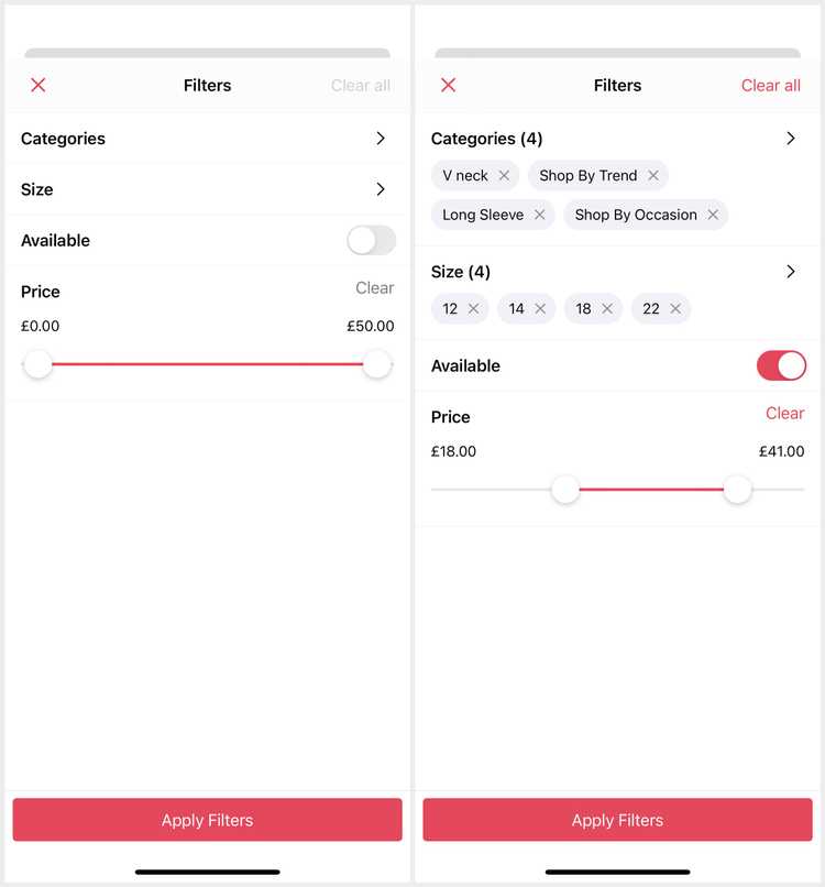
The Filter Selection screen presents the available and selected filters from the Product List state.
The 'Apply Filters' button is sticky presented at the bottom as part of the screen. Tapping it dismisses the screen and applies changes if there are any.
The 'Clear all' button is presented on the navigation bar to allow the user to clear their new selection. This button is disabled unless there are changes.
Container.shared.mappers.filterSelectionViewDataMapper.replace { PoqFilterSelectionViewDataMapper() }Container.shared.views.filterSelectionView.replace { PoqFilterSelectionView() }Filters
Filters are presented as cells within a main table view. The SDK supports the below core filter types and views to present them.
Container.shared.dataSources.filterSelectionViewDataSource.replace { FilterSelectionViewDataSource() }Filters are sent to the backend as query parameters with their id key and their value.
List Filters
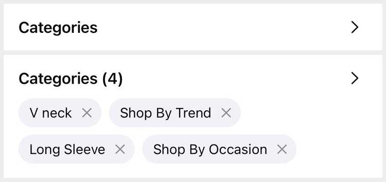
List filters are presented as a link and are selected on a separate screen. When the user selects and saves the options they are shown in pills / chips on the list filter. These can be tapped to remove a specific option.
The Filter Selection screen handles the navigation using the SelectionViewController feature from the foundation, allowing multi-selection.
To modify this you will need to customise the Middleware.filterSelectionNavigation to handle creating and navigating to the filter options screen (in the same way as the Product List is customised for the filters screen).
Container.shared.mappers.filterViewDataMapper.replace { PoqFilterViewDataMapper() }Container.shared.mappers.filterOptionViewDataMapper = { PoqFilterOptionViewDataMapper() }Container.shared.views.filterListView.replace { PoqFilterListView() }Container.shared.views.filterOptionChipView = { PoqFilterOptionChipView() }A list filter value is sent as a , separated array of its selected option id values.
Price Filters
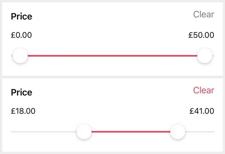
Price filters are presented using a range slider with two sticks to adjust the min and max values of the range. They are accessible to users, allowing selection and adjustment of the two sticks separately.
Tapping the 'Clear' button resets the price range to it's original state.
Container.shared.mappers.filterViewDataMapper.replace = { PoqFilterViewDataMapper() }Container.shared.views.filterPriceView.replace { PoqFilterPriceView() }Container.shared.views.rangeSlider.replace { PoqRangeSlider() }Price filters are sent as two query parameters: minPrice and maxPrice with integer values.
Toggle Filters
Toggle filters are presented as a simple toggle control field tinted based on your apps theme.
Container.shared.mappers.filterViewDataMapper.replace { PoqFilterViewDataMapper() }Container.shared.views.filterToggleView.replace { PoqFilterToggleView() }Toggle filter data is not boolean as expected; it is similar to list filters with two options (for on and off).
Their values are sent as their toggled options id.


