1 min read
Jetpack Compose
Jetpack Compose is Android’s modern toolkit for building native UI. It simplifies and accelerates UI development on Android. Quickly bring your app to life with less code, powerful tools, and intuitive Kotlin APIs.
PoqComposable
PoqComposable is an interface that all Poq Composables implements. To understand which Composables the PoqSDK offers, you can consult the Poq UI component section, with all Views and Composables; or check its implementations by navigating to the PoqSDK PoqComposable.kt file in Android Studio.
All Poq Composables are defined with an interface allowing you to replace its implementation to customize this Composable across the whole app. To replace a PoqComposable, simply create your own implementation and override the Koin dependency using single scope.
You can use all Poq Composables available on the PoqSDK as any other regular Composable using the Composable interface name ComposableInterfaceName(...) and the SDK will take care of providing the appropriate implementation.
Preview
To preview any Composable that uses a Poq Composable, you need to call first StartPoqPreview(). You can send a list of Koin modules as a parameter with your Poq Composable overrides modules to show your customizations.
@Preview@Composablefun CustomScreenPreview() { StartPoqPreview( listOf( myCustomModule ) ) CustomScreen()}PoqTheme
PoqTheme is the MaterialTheme provided by the PoqSDK to style your Composables. Internally, it uses the App Style JSON to create the theme for your App. If you need to customize the theme the recommended way is via App Styling, but you can also replace PoqTheme with your own implementation.
Colours
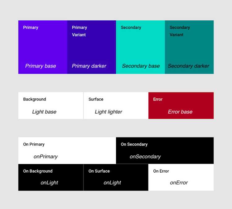
PoqTheme creates a light colour palette mapping the App Style colours in this way:
The recommended way of accessing colours is via MaterialTheme.colors property, as any other app. If you need to access colours not defined on the Material theme, you can access to the AppStyle object via LocalAppStyle object: LocalAppStyle.current.poqColors
Typography
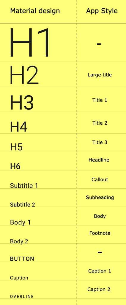
PoqTheme creates the typography mapping the App Style text styles in this way:
The recommended way of accessing typography is via MaterialTheme.typography property, as any other app.
PoqButtons
The PoqSDK defines 4 different buttons and you should use it to follow App Style buttons:

