3 min read
Product Details
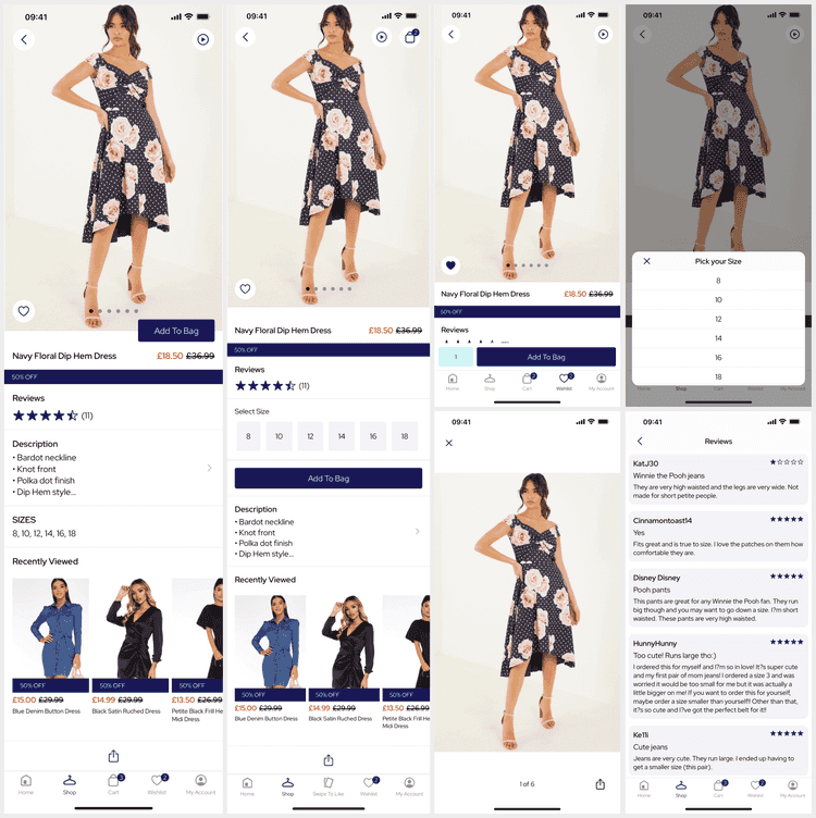
The Product Details (PDP) screen is a core feature, built using the Products API, which presents a single product. It is built using a stack view and we offer different templates and components to tailor your app.
From SS25, for iOS 18+ we use the new iOS zoom transition when navigating to the PDP from most product cards across the app. Note: For custom features, this may require changes to the feature navigating to the PDP.
Deeplinks
# Product Detailsproducts/detail/{id}products/detail/{id}?listing_id={listing-id}products/detail/{id}?listing_id={listing-id}&variant_id={variant-id}products/detail/{id}?variant_id={variant-id}Replace id with the product identifier.
All query parameters are optional, specifying a listing, variant or forms will preselect them on the PDP.
Set Up
The base Product Details does not require any developer set up. However, additional features may require BE work and need to be enabled by a developer.
The product catalogue image ratio should be set as part of app set up to preserve the right UI area for images.
Inline Forms
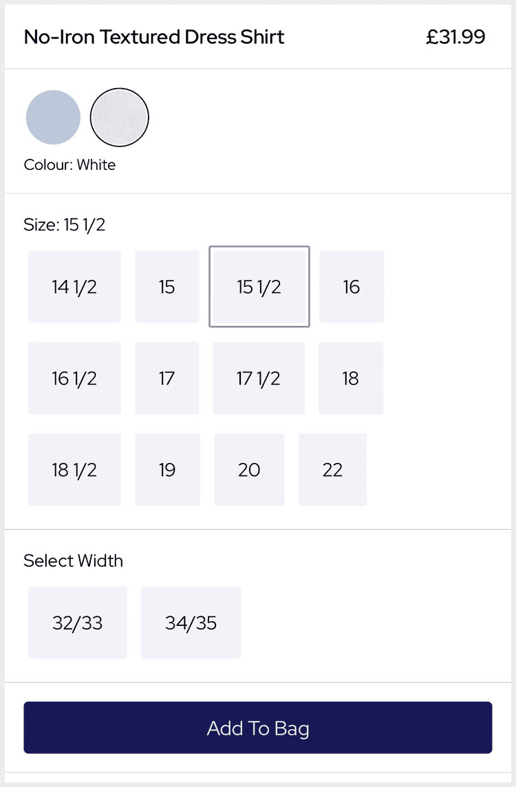
The default preset of the PDP only presents preselected forms (e.g. color). When the user adds to bag the Variant Selector is presented to allow the user to pick the remaining forms (e.g. size).
We also offer an alternate PDP data source to present all the forms on the PDP allowing the user to see and select all available forms (e.g. size, width...).
The form pickers present out of stock as strikethrough but still allow selection. They do not allow the user to select form combinations that have no SKUs; prior to SS25 this was shown as greyed out but invalid variations are now hidden as the user selects forms.
If you are using a variant level Wishlist this is used automatically as the user must be able to select a SKU to wishlist.
Dynamic Content
Product Details supports the following Dynamic Content slots:
| Slot | Version | Where? |
|---|---|---|
before-links | SS24 | Before the product links. |
after-links | SS24 | After the product links, before other carousels. |
scroll-bottom | SS24 | At the bottom of the PDP, before share. |
Additional slots are very easy to add to the data source. Customisations can also easily accidentally remove the SDK default slots listed above.
Video
From SS25, the PDP media viewer supports video in any MediaViewer across the app (product cards and the PDP).
As the user scrolls to a video is autoplays.
It is possible to configure the location of the video within the media or switch back to the previous video button.
Cart Widget
The CartWidget is a standalone component that is not related to the PDP, but does affect the PDP.
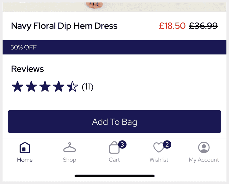
From v25, the PDP will receive all of the actions being processed by the CartWidget.
This allows the PDP to update the form selection as the user selects a form for any CartWidget operation.
From SS25 the PDP uses a 'sticky' CartWidget presented at the bottom of the screen even while scrolling.
Shipment Selection
From v25, the CartWidget and PDP (via delegation) support Shipment Levels and stock focus.
When a shipment level is selected the PDP will change to mapping stock for the selected shipment. For example, if the user selects 'BOPIS' the inline form pickers will update to reflect the 'BOPIS' stock instead of the online stock.
Store Availability
From v24, the PDP can present a Store Availability link that will navigate the user to the Store Finder after selecting a SKU for stock check.
It is easy for a developer to enable this feature but requires that the BE support store stock.
In-Store Mode
From v25, the PDP supports In-Store Mode when Stores is set up. When In-Store Mode is enabled the PDP presents a new stock view showing the In-Store vs Online stock.
Sharing
From AW24, when the user takes a screenshot on the PDP we trigger the share sheet allowing the user to share a link to the PDP. Share links are shortened via Firebase.
Product Storage
The Product Details (PDP) feature uses the Products API with our Product Storage architecture; where a Product can have any number of Forms (color, size, width...) and Variants (SKUs) made from the Variations of those Forms. It's easiest to see this with an example:
- Product - Forms - Color - Pink - Orange - Material - Satin - Cotton - Size - 8 - 10 - Variants (SKUs) - Pink, Cotton, 8 - Pink, Cotton, 10 - Pink, Satin, 8 - Pink, Satin, 10 - Orange, Cotton, 8 - Orang, Cotton, 10This is an example of a Product that comes in 2 Colors, 2 Materials and 2 Sizes. It has only 6 physically purchasable SKUs as the Orange SKUs are not made in Satin.
Whilst most apps have Products with only Color and Size Forms, our Product Storage architecture allows us to cater to any sector and the most complex of Products.
History
- SS25: Updated default template and added autoplay video in media viewer.
- AW24: Added screenshot sharing.
- SS24: Added slots for Dynamic Content support.
- v25: Added stock focus for Shipment Levels (BOPIS) and In-Store mode.
- v23: Store Availability.
- v22: Major rework for Variant Selection and Inline Forms.


