1 min read
App styler: Configure the design of your app
Overview
Use the Poq App Styler to configure core design elements of your app.
The App Styler follows a design system of inheritance, which means the attributes of foundational items are inherited by components. For example, the primary foundational colour influences the colour and style of primary buttons and other important labels used throughout components. Secondary buttons and labels are influenced by secondary colours, and so on.
Using the App Styler, you can change:
- Foundation elements
- Primary and secondary colours
- Fonts
- Components
- Buttons
- Labels
- Icons
- Navigation bar
- Tab bar
- Toolbar
- Search bar
- Segmented control
- Range slider
- Promo banner
- Pricing
- Table cells
- Page controls
- Page controls
- Page views
Themes
The settings you choose in your design system are collectively known as a Theme. Your Theme contains all the design decisions you make using the app styler. When you publish your Theme, it generates the code used to make your changes visible to customers.
Editing your theme using the App Styler tool allows you to rollback decisions and experiment with colour and design combinations until you are happy to publish.
The editing interface
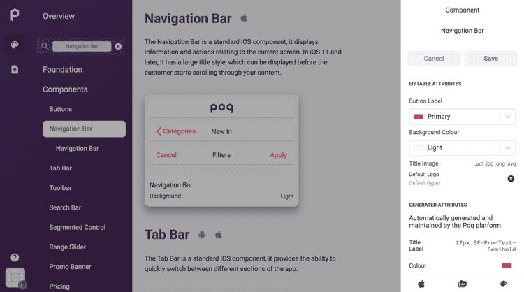
The App Styler displays a preview of items in the main section and a form to edit attributes in the Inspector on the right hand side. Clicking Save in the Inspector updates all the previews that inherit the item.
The inspector displays attributes that you can change as well as static generated attributes that are maintained by the Poq platform to provide best practices for UX and accessibility in your app.
Switch between iOS and Android styles
Some of the design elements and components can be edited differently depending on the operating system.
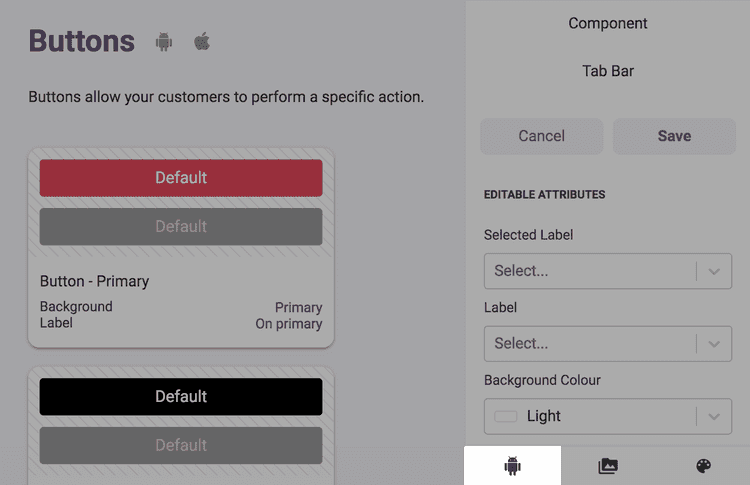
To switch between iOS and Android, click the icon of the operating system you want to preview in the bottom right of the screen:

