2 min read
Product Listing
From v24, Product Listings are widget views that control their own state. Instead of the Product List, the Product Listing handles navigation and user interaction.
Product Card
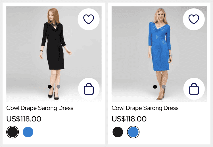
Product Listings use the 'Vertical' ProductCard view to be consistent with the rest of the app (Carousels).
From SS25, the SDK offers a 'Clean Image' ProductCard view which moves UI such as the CartWidget off of the MediaViewer to not obstruct the media. When using this the CartWidget prefers the default button style and allows the 'Quantity Picker' style.
Images
Images are presented first within the MediaViewer (a paged view) that can show any number of images or videos.
When showing more than a single image or video, a page indicator is presented over the bottom of the image.
The current media position is lost when the cell is scrolled out of view due to the nature of iOS lists.
The media limit is controlled by a catalogue setting that affects all product cards (the PLP and Carousels). By default the limit is set to 1 which shows only the first image.
Information
The ProductCard supports more than the listing presents but, to keep the Product List simple, listings present only the brand, title and price. From SS25, we also present the product rating.
Variant Grouping
Product listings work with variant groups instead of variants (as explained here). The last slot of the listings is used to present the listings other variant groups.
The SDK offers different variations of this view but defaults to swatches.
Swatches
The Swatches view (the default) presents swatches for the variant groups. This allows the user to switch the appearance of the listing by tapping on a different swatch.
When the user switches swatch the selection is sent as the formVariationIds to persist to the Product Details screen and when adding to cart.
The selection is lost when the cell is scrolled out of view due to the nature of iOS lists.
More Options
The MoreOptions view presents 'More Colors' text if there is more than 1 variant group. This is a static view but the image can be customised via AppStyling.
Cart Widget
From v24, Product Listings support the CartWidget to allow users to add a SKU to the Cart from the Product List.
When enabled, the widget will fetch the full Product from the Product API then show the VariantSelector as needed.
By default, the CartWidget is presented in the bottom right corner over the MediaViewer using the 'Icon' style matching the Wishlist button. From SS25, you can use the 'Clean Image' ProductCard style to move buttons under the MediaViewer and allow the 'Quantity Picker' style.
Wishlist Widget
Listings can be wishlisted at Listing or Product level; listings do not have Variant information so do not support Variant level wishlists. When set to a Variant level wishlist the WishlistWidget is hidden.
From SS25, you can use the 'Clean Image' ProductCard style to move buttons under the MediaViewer. The WishlistWidget moves next to the title when using this style.
History
- SS25: Added ratings and support for videos in the MediaViewer.
- SS24: Added the 'Clean Image' card style to declutter.
- v24: Added support for Add to Cart, multiple images and swatches.
