2 min read
Buttons
Buttons allow your customers to perform specific actions throughout your app. By default, buttons follow the color hierarchy defined in your foundation styles, but you can customize their appearance to match your brand.
How Buttons Work
Button hierarchy:
- Primary buttons - Most important actions (Add to Cart, Purchase, Sign In)
- Secondary buttons - Supporting actions (Save for Later, Share, Cancel)
- Tertiary buttons - Minimal actions (Learn More, View Details)
Foundation integration:
- Buttons inherit colors from your foundation color palette
- Customizations override foundation defaults
- Changes apply to all instances of that button type
Step-by-Step Customization
1. Access Button Styling
- From the Poq App Manager home page, select App Styler
- Click Components in the left-hand menu
- Click Buttons to open button customization
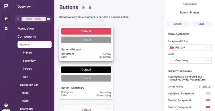
2. Select Button Type
In the left-hand column, choose the button type you want to edit:
- Primary - Main action buttons
- Secondary - Supporting action buttons
- Destructive - Delete/remove actions
- Link - Text-only buttons
The selected button preview appears in the central column.
3. Customize Colors
In the right-hand column, customize the button appearance:
Background Color:
- Choose the button's background color
- Use your brand colors for consistency
- Consider contrast with button text
Label Color:
- Select the text color for the button
- Ensure readability against background
- Follow accessibility guidelines for contrast
4. Save Changes
Click Save to apply your changes across the app.
Button Types and Usage
Primary Buttons
Best for:
- Purchase actions (Buy Now, Add to Cart)
- Sign up/login actions
- Form submissions
- Main call-to-action
Styling recommendations:
- Use your primary brand color
- High contrast with background
- Bold, attention-grabbing appearance
Secondary Buttons
Best for:
- Save for later actions
- Share functionality
- Alternative options
- Supporting navigation
Styling recommendations:
- Complementary to primary buttons
- Less prominent but still clear
- Often outlined or lighter colors
Destructive Buttons
Best for:
- Delete actions
- Remove items
- Destructive operations
- Warning actions
Styling recommendations:
- Use red or warning colors
- Clear indication of destructive action
- High contrast for visibility
Design Best Practices
Color Selection
✅ Brand consistency - Use colors from your foundation palette
✅ Accessibility - Ensure WCAG AA contrast ratios (4.5:1 minimum)
✅ Hierarchy - Primary buttons should be most prominent
✅ Platform conventions - Follow iOS/Android design guidelines
Visual Hierarchy
Primary buttons should:
- Stand out the most on the screen
- Use your strongest brand color
- Have the highest visual weight
Secondary buttons should:
- Be clearly interactive but less prominent
- Complement primary buttons
- Not compete for attention
Testing Your Changes
- Preview in App Styler - Check the central preview column
- Test different contexts - Buttons appear on many screens
- Verify contrast - Use accessibility tools to check contrast ratios
- Check both platforms - Ensure buttons work on iOS and Android
Common Button Configurations
E-commerce Focused
Primary Button:- Background: Brand primary color- Label: White or high-contrast color- Usage: Add to Cart, Buy Now
Secondary Button:  - Background: Transparent or light gray- Label: Brand primary color- Usage: Save for Later, Continue Shopping
Minimal Design
Primary Button:- Background: Solid brand color- Label: White- Usage: Main actions
Secondary Button:- Background: Transparent- Label: Brand color- Border: Brand color outline- Usage: Secondary actions
High Contrast
Primary Button:- Background: Dark color (navy, black)- Label: White- Usage: Maximum contrast and readability
Secondary Button:- Background: Light gray- Label: Dark color- Usage: Clear but less prominent
Troubleshooting
Buttons not updating:
- Ensure you clicked Save after making changes
- Check that you're editing the correct button type
- Clear app cache and refresh
Poor contrast/readability:
- Test color combinations with accessibility tools
- Use high contrast between background and label
- Consider users with visual impairments
Inconsistent appearance:
- Verify foundation colors are set correctly
- Check that all button types follow the same style principles
- Test across different app screens
What's Next?
- Navigation Bar - Customize top navigation styling
- Foundation Elements - Set up your base color palette
- Publishing Changes - Deploy your styling updates
