3 min read
App Stories
The Stories Tool in the App Manager is used to control the App Stories on the homescreen. Each story is made up of story cards, full-screen image and video content that allows users to create similar content to what you would see on social media, whilst making that content immediately shoppable within the feature. You can link the content to single products, multiple products, categories and more.
Stories can be configured as circular or rectangular referring to how they appear on the home screen. Circular is recommended to match social platforms but rectangular is a good option if the client only wishes to show 2-3 at a time as they take up more screen space. Switching from one shape to another is a developer-level change so please talk to your Customer Success Manager if you wish to change.
For the legacy CMS guide, please click here.
Published and Draft
There are two views available in the left-hand navigation bar in the Stories tool; published and current draft.
Published

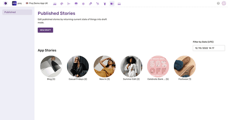
The published view is the first view you’ll see when you load the Stories tool. It displays the set of stories as they are currently configured for the app. You’ll see a carousel of story cover images which can be selected to view the story cards that sit within them. The number in brackets indicates how many story cards are configured per story. You can also click the story cards themselves to reveal information about their configuration such as Content Type, Action Type and Duration.
The carousel will adjust based on the filter fields near the top of the screen. This allows you to preview the stories for specific dates and times in the future, giving you confidence that any scheduling has been set up correctly.
When you are ready to make changes to the stories, you can select “New draft” to create a new draft, or “Resume editing” to continue editing a draft you created earlier. Currently, it is only possible to have one draft at a time to avoid conflicting changes by multiple users, so make sure to communicate well with colleagues who might also be making changes.
Current Draft

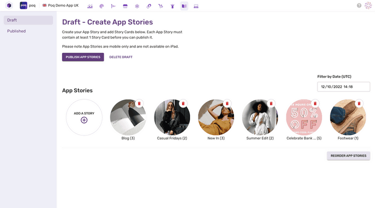
The draft view is where users can make changes to the stories they want to be displayed in the app. The overview screen is very similar to the published view, giving the user a rotating carousel of stories, with a few actions available to the user.
- The user can change the order of the stories displayed by clicking “Reorder App Stories” and then dragging and dropping stories.
- The user can delete each story by clicking on the bin icon.
- The user can add a new story.
- The user can publish the current draft to the live app.
- The user can delete the current draft, taking them back to the published screen.
Creating a Story
To set up a new story, follow these steps:
- Create a new draft or edit the existing one.
- Once in the Draft section, click “Add a Story” to open the story creation section.
- Configure the story card with the following information
- Story title - Used as a label when playing through the story
- Story cover image - Follow the recommended aspect ratio for circular or rectangular.
- Schedule - This will hide the story outside of the scheduled window and is optional.
- When you’re happy with the configuration, click save.
- Click Story Cards in the left nav to move on to card creation
- Click “Add a Story Card” to open the card creation section
- Configure the story card with the following information
- Story Card Title - Used in analytics and to aid visually impaired users
- Swipe Label - this label will appear above the chevron at the bottom of the screen informing the users that they can swipe up to interact with the story
- Content Type - Choose from Image/GIF and Video. Video should only be used from v22 onwards.
- Autoplay length - Determines how long the story card will remain on the screen before automatically moving to the next card.
- Action Type - Links the story card to a products, a category or a web URL. You may select one single product to launch a single Product Details Page when swiped or multiple products to launch a Product List Page. Selecting a category will also launch a Product List Page driven by the chosen category. A URL will launch a webview.
- Story Image or Video URL - Depending on the content type, set either the image, GIF or video URL.
- When you’re happy with the configuration, click save.
From here you can continue to add more story cards and stories until you are happy with the draft.